Let’s Connect
Feel free to reach out for collaborations or just a friendly hi! ✌
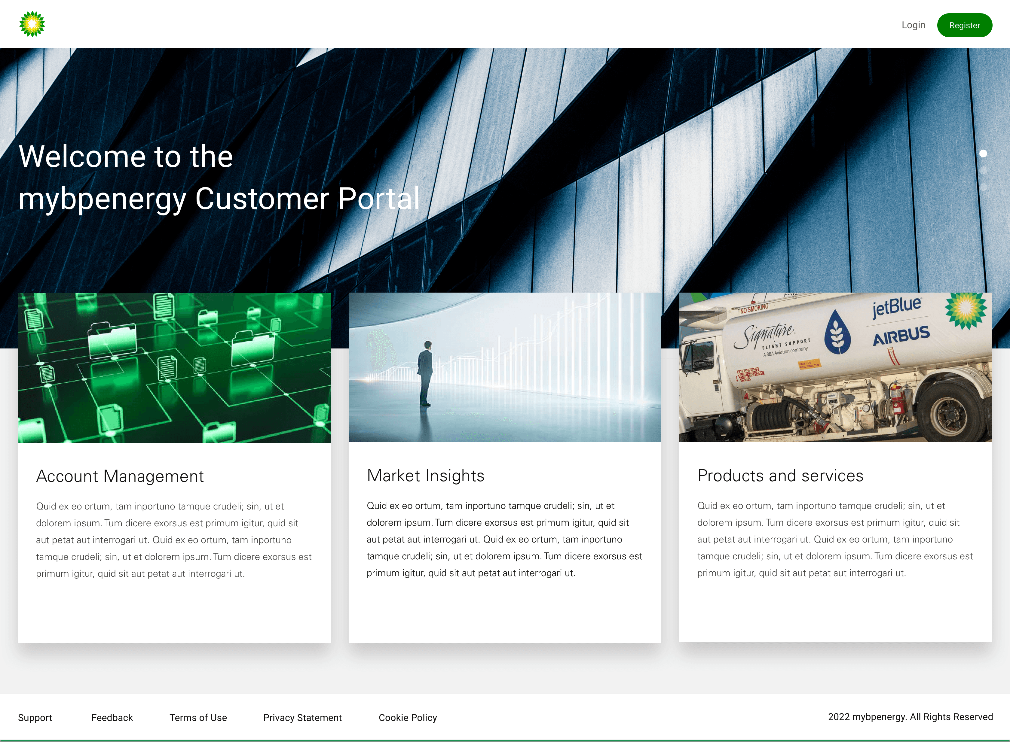
mybpenergy

My Role
Worked as a Product designer with a team of 2 designer in an agile process including Product manager, Scrum master and Developers.
Platforms & Tools Used
Sketch - Design Tool
Azure DevOps - Management and monitoring progress
Zeplin - Prototyping & Dev handover
Mural - Brainstorming & discussions
Duration
2 years
Overview
mybpenergy, is an energy transporting & shipping website. It allow to access live and historic market prices, access post trade documents (invoices, contracts) and where applicable submit nominations.
mybpenergy is a entry point for accessing information from BP wherever you and whenever you need it.
Users
Energy transport users access prices, documents, and submit nominations conveniently.
Business
Enterprise
Industry
Oil and Gas
Design Process
The mybpenergy designs goes through many stages of design process in order to ensure a systematic and user-centered approach.
Discover
Define
Design
Deliver
Discover
Problem Statement
Energy professionals and businesses rely on MyBPEnergy to access live and historic market data, view important documents like invoices and contracts, and submit nominations. However, the current portal is not easy to use, which slows users down and creates frustration.
MyBPEnergy needs to be redesigned to make it simple, intuitive, and efficient, so users can easily find what they need and get their work done anytime, anywhere.
The onboarding process needs to be straightforward and easy to follow.
If I can’t figure out how to set up my account or navigate the portal quickly, it wastes time I don’t have and delays critical tasks like tracking market trends or submitting nominations.
I want to focus on analyzing data and making decisions, not spending hours trying to figure out how to use the portal.
When a tool is complicated/unclear, it makes my job harder and adds unnecessary frustration to my day.
The Business Goals
The goal is to create a simple and user-friendly onboarding process that helps users set up their accounts quickly and confidently. The portal should have a clear layout, making it easy to find key features like market data, documents, and nominations.
By saving users time and removing barriers, the platform will ensure they can complete their tasks efficiently while enjoying a smooth, frustration-free experience.
Understanding Users Needs
We were in a constrained environment when it comes to research, most of the methods are already in place and used as a standard by client team and we deal with just design related changes.
Sometimes back on pushing harder on research part, they shared with us some of the recordings they used to have over phone calls while talking to customers and collecting feedback about their services.
They have recently started to conduct some of the interviews over online meeting services and shared some of the links with us.
After going through it, we tried to identify gaps by writing facts shared by users to narrow down their pain points using Affinity Mapping technique given below
Make onboarding easy with a step-by-step process.
Help users set up accounts quickly and confidently.
Remove barriers during the onboarding phase.
Onboarding Experience
Improve navigation with a clear layout.
Ensure users can easily find market data, documents, and nominations.
Design an interface that is intuitive and user-friendly.
Navigation and Usability
Save time for users by simplifying tasks.
Minimize delays in accessing key features.
Support users in completing critical tasks quickly, like tracking trends and submitting nominations.
Efficiency and Productivity
Provide a smooth, frustration-free experience.
Enhance user confidence and ease of use
Create a portal that empowers users to focus on their work without distractions.
User Satisfaction
Define
Insights to “How Might We’s”
These prioritize critical areas of improvement for MyBPEnergy: onboarding, navigation, task efficiency, and user satisfaction.
Insight 1:
Complex onboarding process causes delays.
HMW make the onboarding process simple and straightforward so users can quickly start using the portal?
Insight 2:
Navigation issues frustrate users trying to find key features.
HMW design an intuitive layout that highlights key features like market data, documents, and nominations?
Insight 3:
Time-consuming tasks reduce user productivity.
HMW streamline workflows so users can complete tasks like tracking trends and submitting nominations faster?
Insight 4:
A frustrating experience lowers user satisfaction.
HMW create a seamless and frustration-free experience that boosts user confidence and satisfaction?
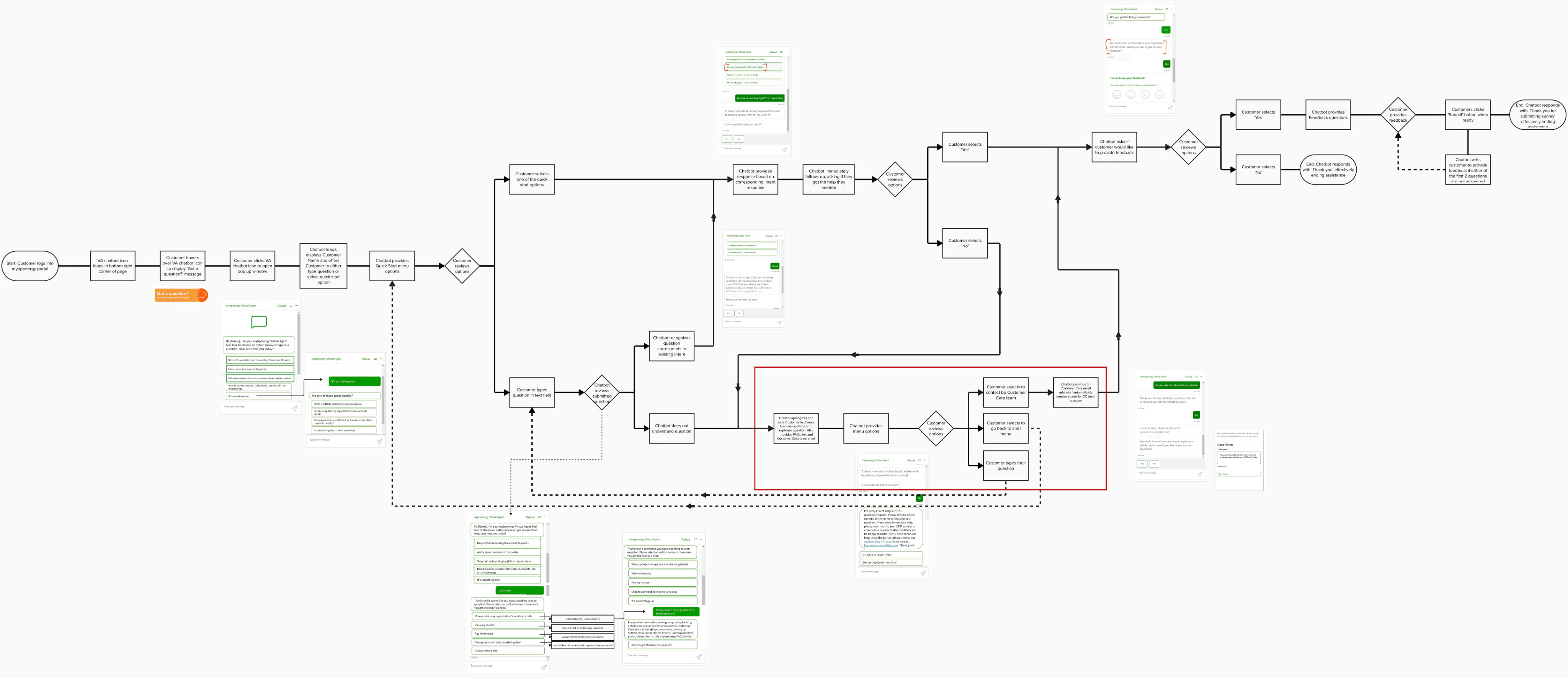
User flow for usability testing
The user flow for usability testing for the redesigning of MyBPEnergy portal, focusing on key user tasks and pain points. I worked out the user flow with the following questions in mind:
Q1. What would the users be looking atWhere are all of the user’s decision points?
Q2. What are the alternate paths or error paths?
Q3. Are all alternate paths necessary? Are some alternate paths unavoidable?
Q4. How can we help users avoid or recover from error paths?
Design
Let’s Design
The approach was quite clear after HMW method and user flow we started
with proposing related screen design solution.
We went through lots of high fidelity screens iterations and then some random close
to deadline day, screens were approved sharing the same here.
Start Onboarding Journey with bp
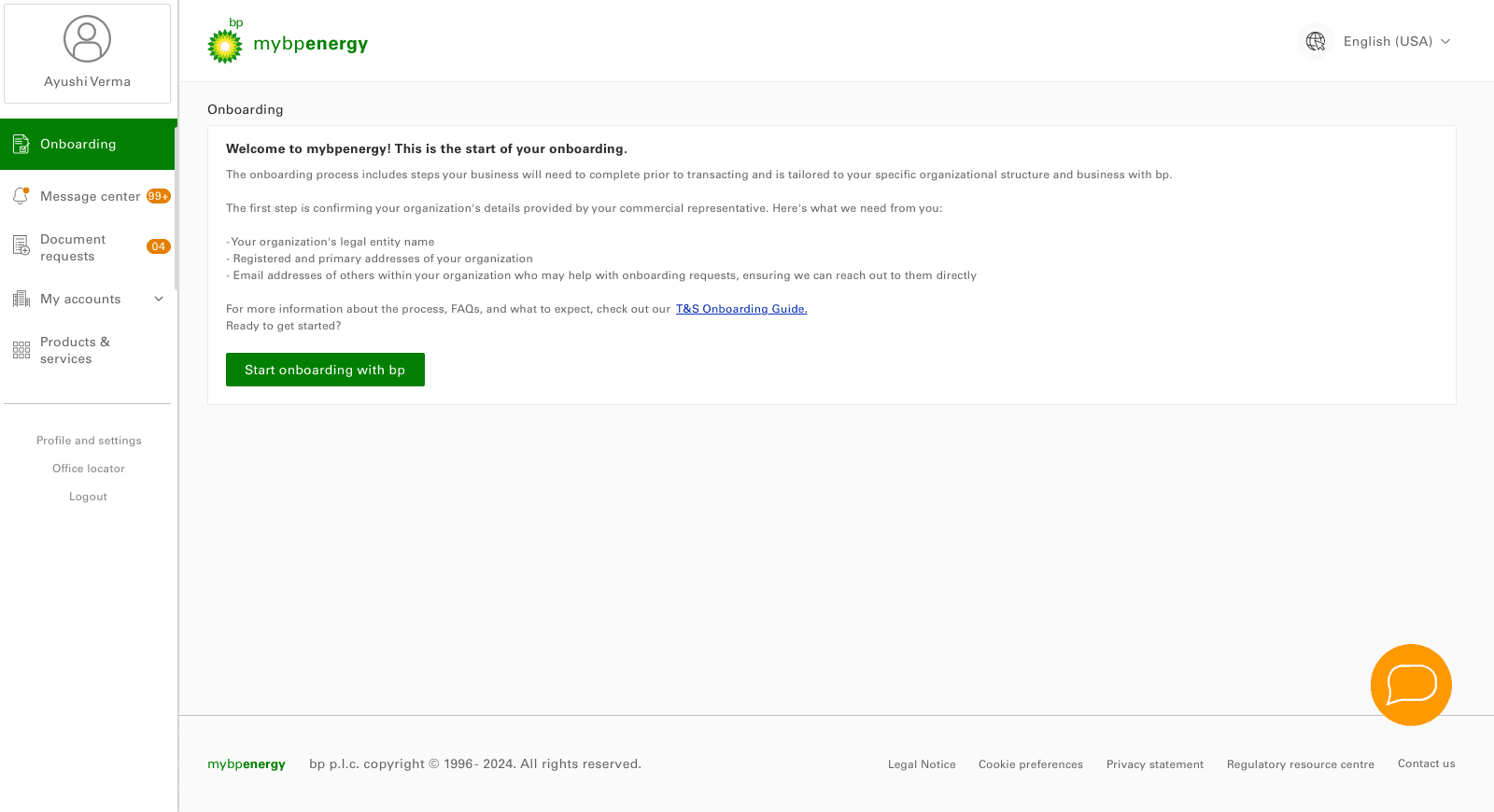

Onboarding page 1.00:
Start Onboarding
First time onboarding to mybpenergy
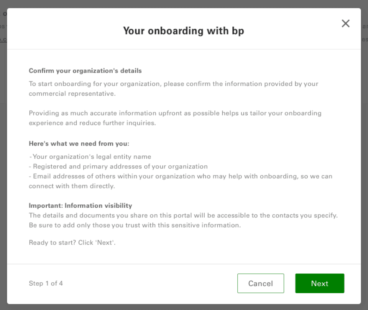
Start Onboarding Journey with bp (modal 1 of 5).
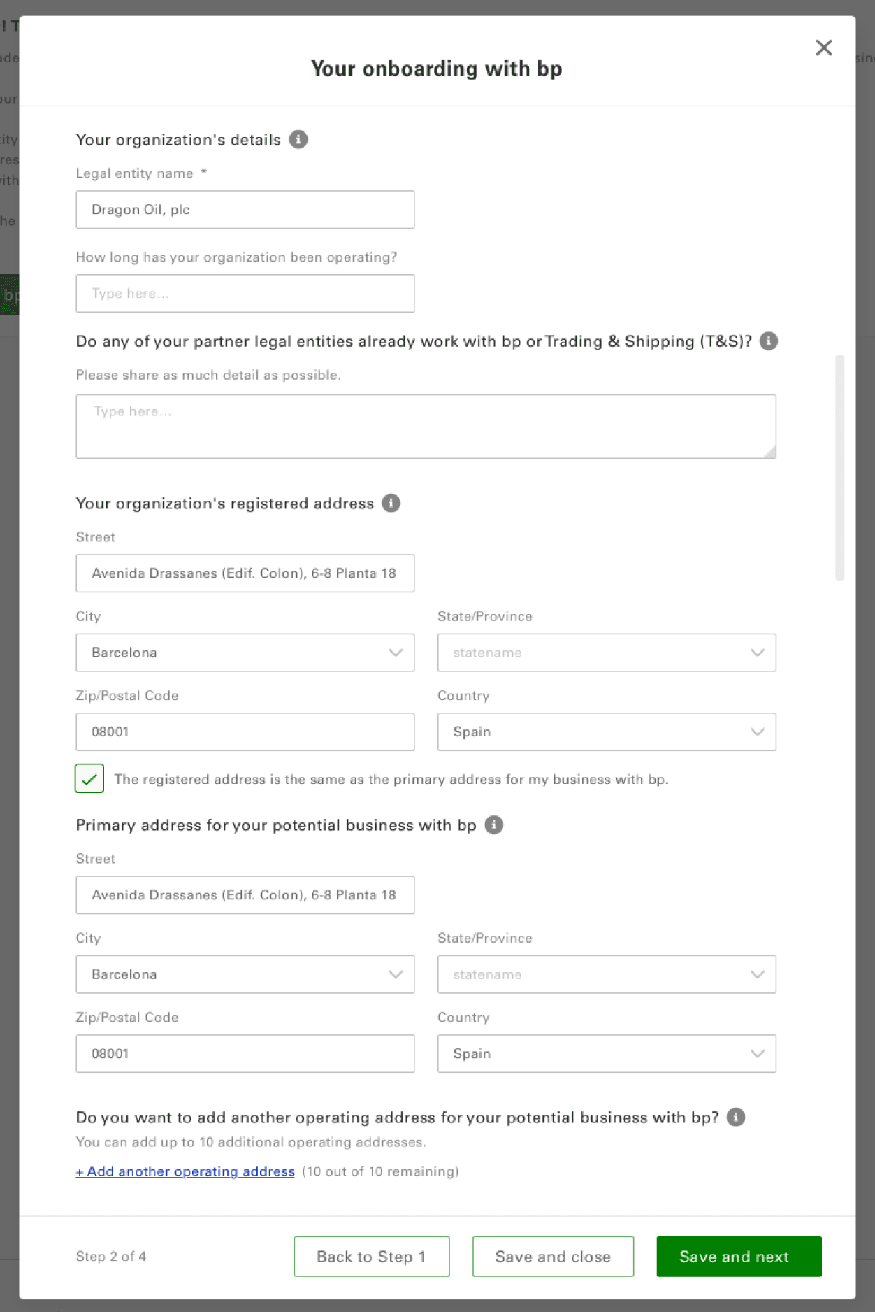
Start Onboarding Journey with bp (modal 2 of 5).
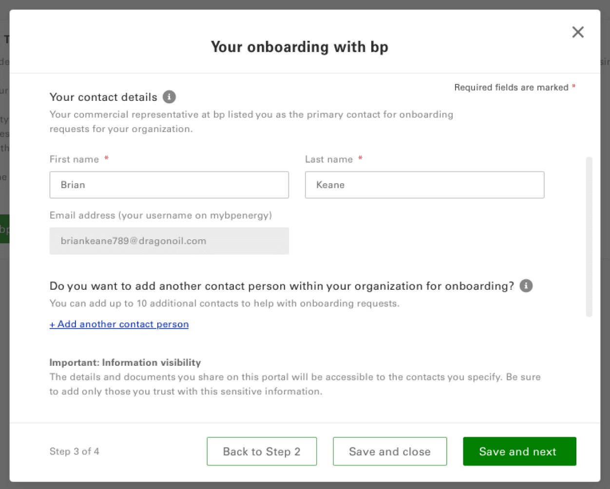
Start Onboarding Journey with bp (modal 3 of 5).
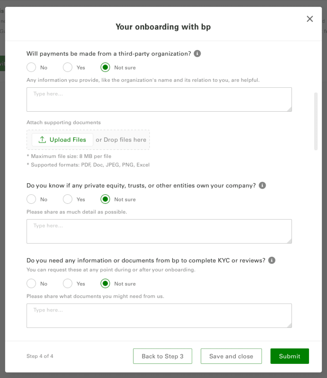
Start Onboarding Journey with bp (modal 4 of 5).
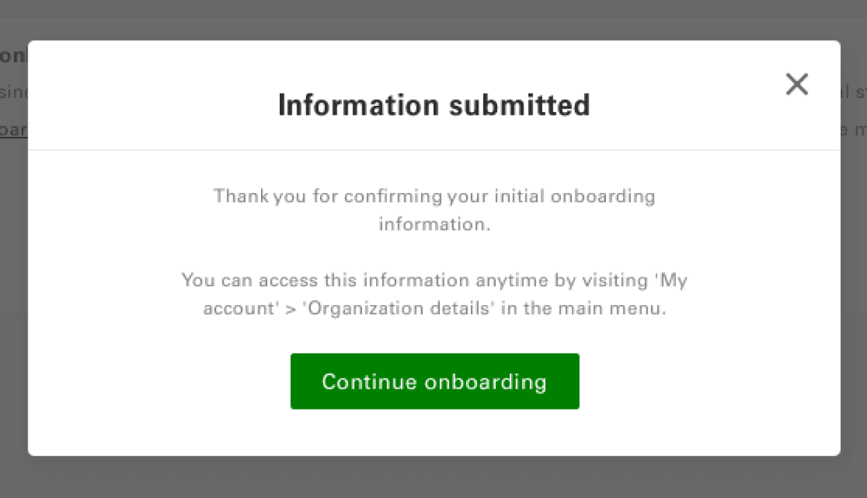
Start Onboarding Journey with bp (modal 5 of 5).
User onboarded to the platform
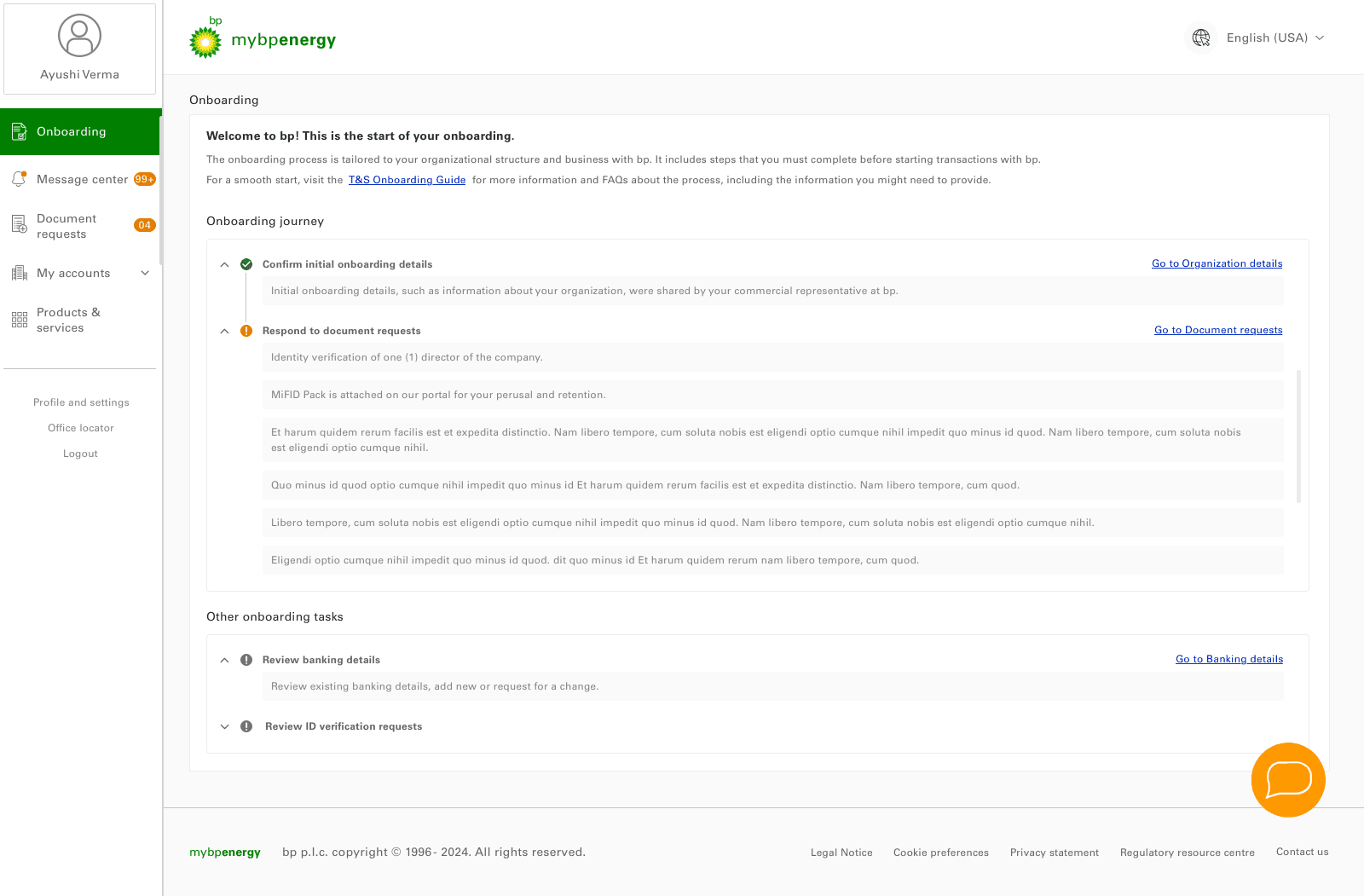
Onboarding page 2.01:
Initial Onboarding complete.
Respond to document requests.
Other onboarding tasks
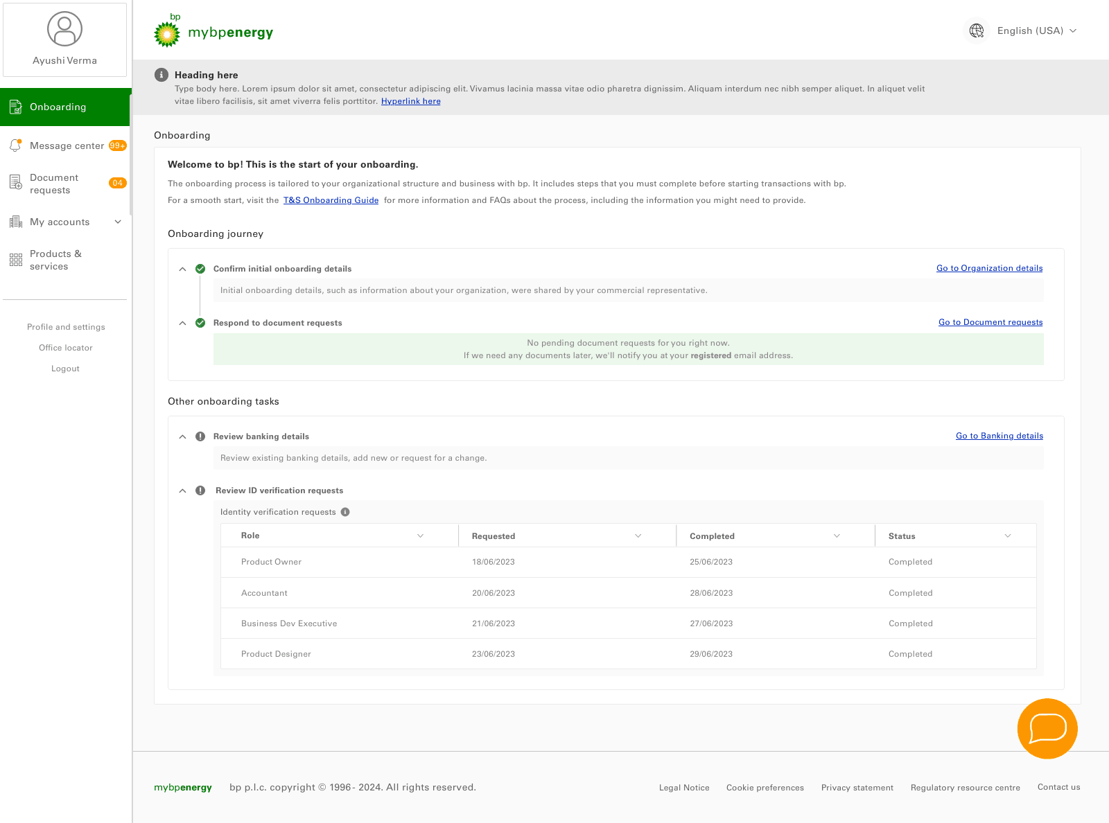
With system notification banner
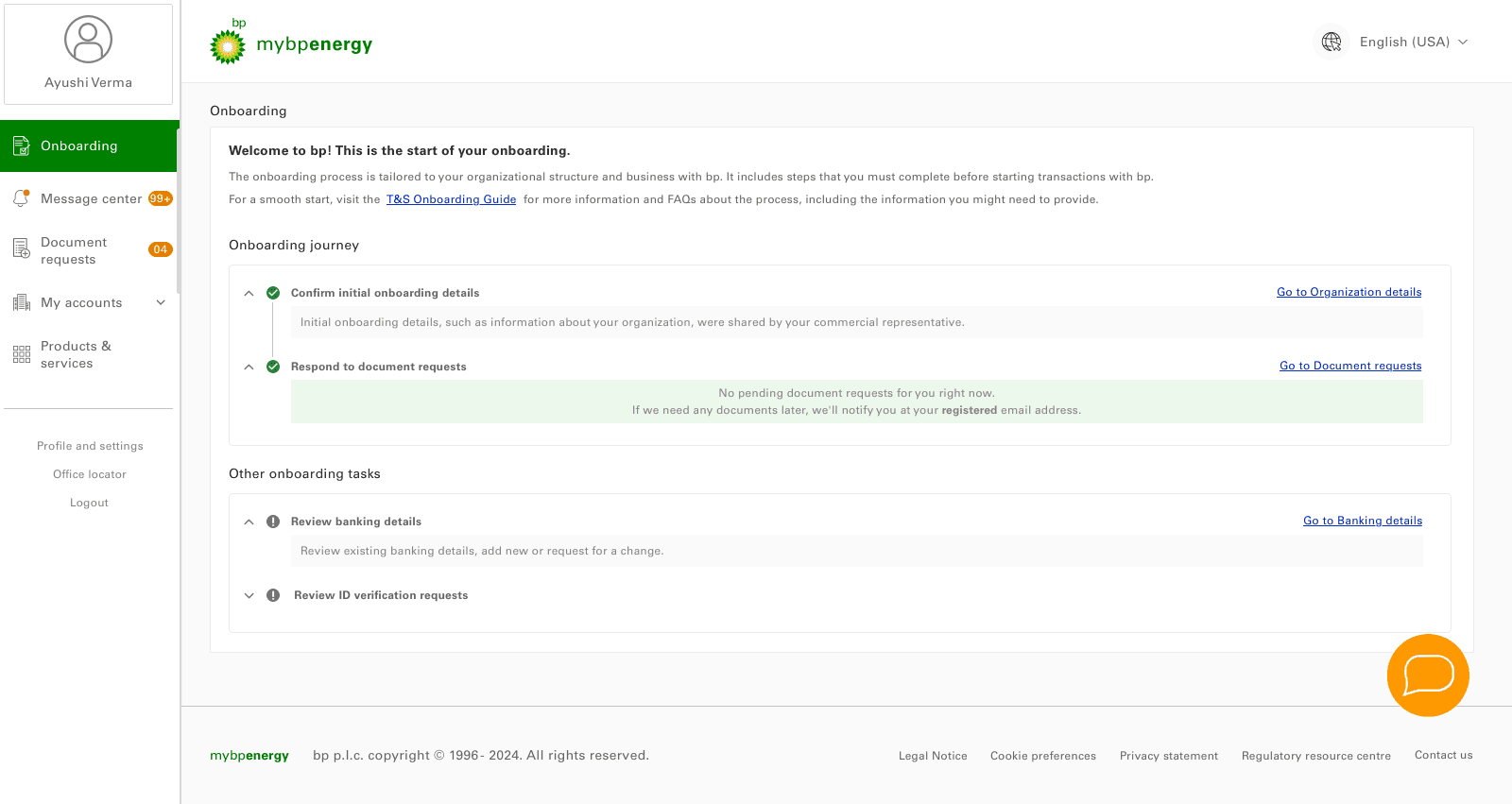
Collapsed accordion view
Document Requests page view
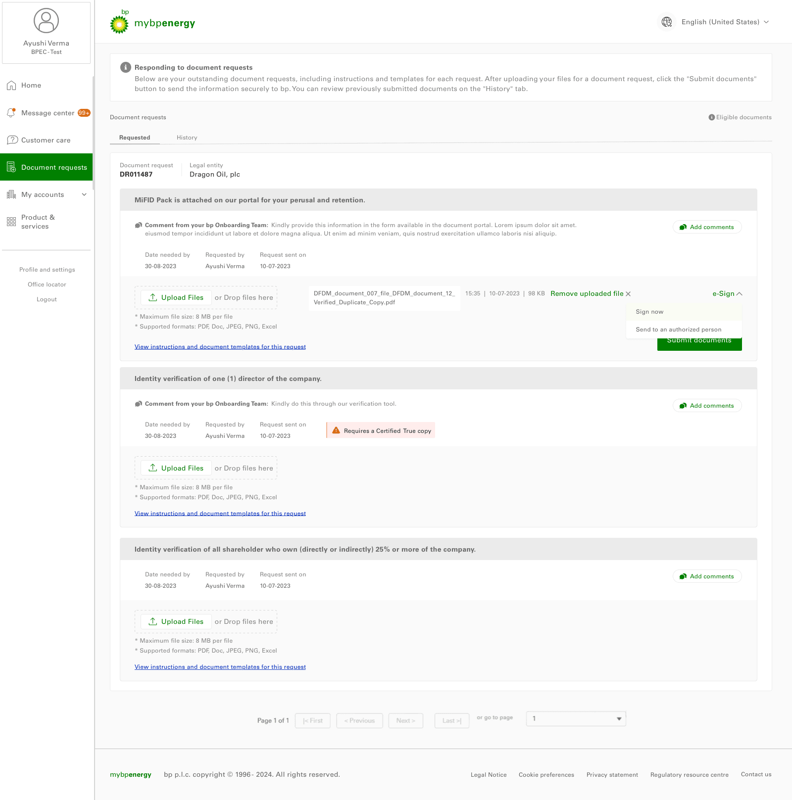
Document requests 1.01:
Upload files for a verification for an authorized person.
Banking Details view
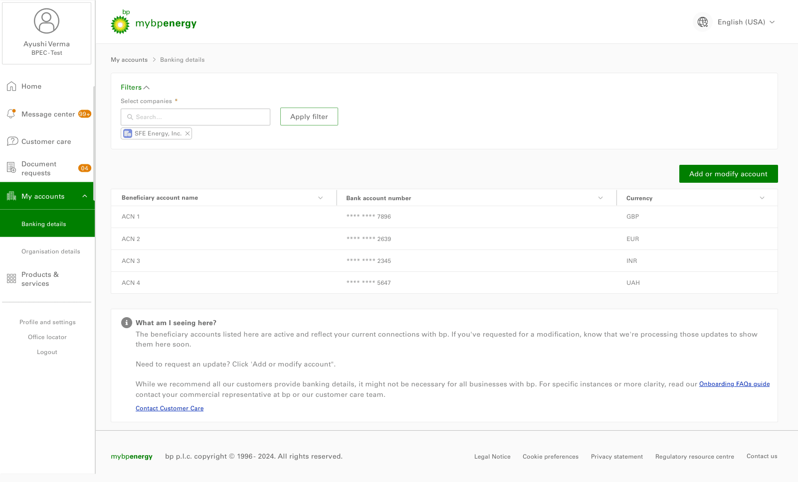
Banking Details 1.01:
Check and verified banking details view, with beneficiary account no.,name and currency.
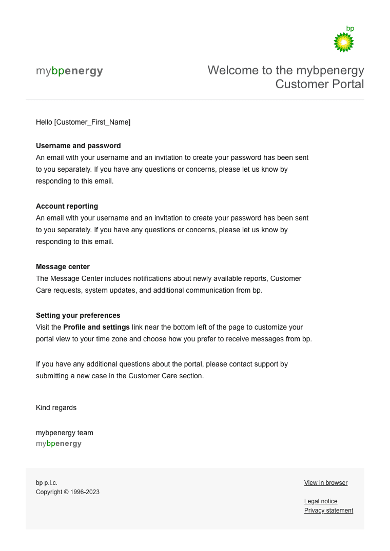
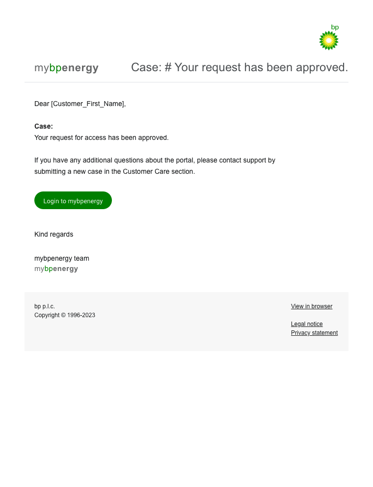
Emailer designs
Deliver
Problems and Solutions Achieved
In this phase, we addressed key challenges and implemented solutions to improve the mybpenergy portal, resulting in a more intuitive, efficient, and user-friendly experience.
Onboarding Complexity:
Problem: Users struggled with a confusing onboarding process, leading to delays.
Solution: We simplified the process with a guided, step-by-step walkthrough, helping users set up quickly and confidently.
Result: Onboarding time decreased by 40%, and users felt more confident starting their journey.
Time-Consuming Tasks:
Problem: Critical tasks like tracking trends and submitting nominations were slow and repetitive.
Solution: We streamlined workflows by automating repetitive tasks and adding quick access buttons.
Result: Task completion time reduced by 25%, boosting productivity.

Frustrating User Experience:
Problem: Users felt overwhelmed and frustrated with the portal.
Solution: We created a clean, minimalistic design, added helpful tooltips, and improved the support system.
Result: User satisfaction increased, and support inquiries dropped by 15%.
Difficulty Completing Tasks:
Problem: Users struggled with submitting nominations and finding documents.
Solution: We simplified the nomination process and reorganized documents for easier access.
Result: Users completed tasks faster, with fewer errors and improved accuracy.
Outcomes
The redesign of the mybpenergy portal improved the user experience by simplifying onboarding, enhancing navigation, and streamlining key tasks.
40% reduction in Onboarding Time
Simplified, step-by-step guidance for quicker setup.
30% faster navigation
with a redesigned, intuitive layout.
25% reduction in task completion time
for key tasks like market tracking and nomination submissions.
15% decrease in support inquiries
as a result of a cleaner, frustration-free experience.
The intuitive design empowers users to focus on critical tasks, boosting both productivity and satisfaction. Overall, the portal is more efficient, user-friendly, & aligned with business goals.
View other case study